[2] - 7/12/21
UI Design
This week I worked on the UI design for the mobile app.
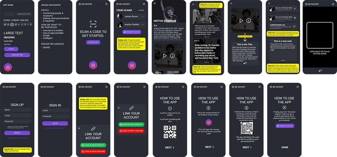
I started by creating a design philosophy for the project. Our team's overall goals for the project are to connect people and museums, and to make museum visits more personalized and impactful for visitors. With this in mind, I also defined how we want the app to be percieved: as modern and innovative as well as simple and approachable. We want people to view this app as easy to use and as a step forwards for interactive museum technology.
The design uses the principle of limited color to direct users. I decided on a purple accent color for the buttons. I also added a magenta highlight on the camera button to give it unique importance in the design. I wanted to make the camera button stand out and be "clickable."
The design was made to be simple. There isn't much on the screen at one time, and the important options are very visible.
Below is the full version of the UI mockup I made for the app. (Click for the full version) Some of the screens in the mockup contain components that museum curators can choose to add to an artist page, but aren't full pages themselves.


